Skip to content

Fix misplaced "previous" icon #501

New issue

Have a question about this project? Sign up for a free GitHub account to open an issue and contact its maintainers and the community.

By clicking “Sign up for GitHub”, you agree to our terms of service and privacy statement. We’ll occasionally send you account related emails.

Already on GitHub? Sign in to your account

Merged
merged 2 commits into from
Dec 10, 2017
Merged

Fix misplaced "previous" icon #501

merged 2 commits into from
Dec 10, 2017

Conversation

lifta42
Copy link
Contributor

@lifta42 lifta42 commented Dec 2, 2017

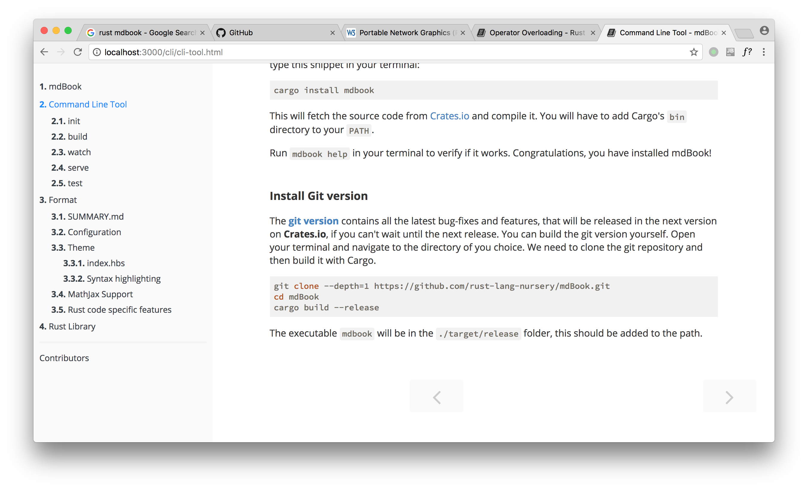
The original state:
screen shot 2017-12-02 at 2 24 11 pm

The fixed one:
screen shot 2017-12-02 at 2 24 57 pm

The arrow for "previous chapter" was on the incorrect position when screen width is between 1060px and 1250px.
@lifta42
Copy link
Contributor Author

lifta42 commented Dec 2, 2017

After this posting I suddenly thought of checking some random books generated by gitbook. It seems like they are choosing another style, lol:
screen shot 2017-12-02 at 2 42 32 pm

The margin of both sides are fixed when the page is even thinner.

@stgn
Copy link
Contributor

stgn commented Dec 3, 2017

Also covered by #470.

@Michael-F-Bryan
Copy link
Contributor

It seems like both this and #470 will fix this problem, @lifta42 and @stgn which fix do you think we should go with?

@lifta42
Copy link
Contributor Author

lifta42 commented Dec 4, 2017

I'm sorry that I have done some duplicated work since @stgn posted earlier. I have no idea how he solved this bug. I think it's okay that you try to merge his solution first, and I will close this one if it works well.

@lifta42
Copy link
Contributor Author

lifta42 commented Dec 6, 2017

Hey guys.

I have waiting for two days while tracking #470 , but it seems that no one is posting anymore. I read that PR carefully and figure out a solution that covers everything it does (at least everything the initial post mentioned). Here comes the effect of toggling sidebar on small screen:
2017-12-06_16-16-11

Addition to this, there are several points that I should mention:

  • I made a mistake before to perform changes on generated CSS files. This time all the changes are made on Stylus and Mustache files, and the CSS is generated correctly.

  • It seems that 1250px was just a random choice, for triggering the previous/next icons either vertical aligned or bottom placed. I found a constant 1060px in variables.stylus with a ridiculous long name, so I tweak the vertical/bottom trigger width to it. This cause another problem, that when the screen width is between 750px and 1060px, the bottoms would be separated wider than the main content, because 750px is set to be the max width of content. So I add a wrapper for navigating icons so they will never get too wider, as below:
    screen shot 2017-12-06 at 4 33 08 pm

  • Finally, 750px was a magic number in stylesheet, so I extract it into variables.stylus.

Hope this PR satisfy @Michael-F-Bryan and I own an apologize to @stgn for re-doing the work of yours. I am just a Rust beginner and this flaw delivered to Rust By Example really kills me. Big appreciate for fixing it soon.

@Michael-F-Bryan
Copy link
Contributor

Michael-F-Bryan commented Dec 7, 2017

Sorry for the delay @lifta42! I'm on the other side of the country for a competition and haven't had time for sleep, let alone checking GitHub 😞

I'm thinking we could merge this PR as-is, then try to resolve the conflict with #470. How does that sound to you, @stgn?

@Michael-F-Bryan
Copy link
Contributor

It doesn't look like there's any disagreement, so I'm going to merge this.

@Michael-F-Bryan Michael-F-Bryan merged commit 3838fa0 into rust-lang:master Dec 10, 2017
@lifta42
Copy link
Contributor Author

lifta42 commented Dec 11, 2017

Thanks. Looking forward for next PR.

@Michael-F-Bryan
Copy link
Contributor

It looks like some of the CSS changes broke how the page is rendered. The page width looks like it's wider than the browser window and the left/right arrows are now drawn on top of the page's content. It looks like there might be something wrong with the nav-wrapper class and the width it uses.

I was able to reproduce this in Chrome on my laptop (~1440px wide), but when you pull up the dev tools and make it emulate a mobile device even at full width the page behaves as it should.

screenshot_2017-12-26_213849
screenshot_2017-12-26_213841


What's the best way to deal with this? We could temporarily revert the PR and then make an updated one where the issue isn't present. Otherwise we can try to figure out what the issue was and make a new PR that fixes it.

@stgn
Copy link
Contributor

stgn commented Dec 30, 2017

FWIW, I corrected the regression when resolving conflicts for #470.

Ruin0x11 pushed a commit to Ruin0x11/mdBook that referenced this pull request Aug 30, 2020
Sign up for free to join this conversation on GitHub. Already have an account? Sign in to comment
Labels
None yet
Projects
None yet
Development

Successfully merging this pull request may close these issues.

3 participants